.svg)

How I Found My People (and Their First Magazine)
Last year, I made the move to Malibu—drawn by the ocean, the light, and something I couldn't quite name yet. Then I saw a post on social media about Surf Canyon, this incredible community hub for makers, doers, and farm-loving folks tucked into the hills. They were looking for help designing their first magazine issue.
I didn't hesitate. I messaged them immediately: Hey! I would love to help.
The Brief That Wasn't Really a Brief
Surf Canyon isn't your typical client. Founded in 1892, this place describes itself as "an experimental urbanist community." It's home to creatives, entrepreneurs, artists, chefs, makers, farmers, and local business owners who believe that
community, friendship, creativity, and making things with your hands matter more than your bank account.
Their manifesto hit me right in the chest: "In today's world, community, true friends, and a walkable environment can be hard to come by... This does not have to be the case."
So when they asked me to design their first periodical, I knew this wasn't about creating something slick and corporate. This needed to feel like the place itself—raw, thoughtful, rebellious, and deeply rooted in history.
Typography as Time Travel
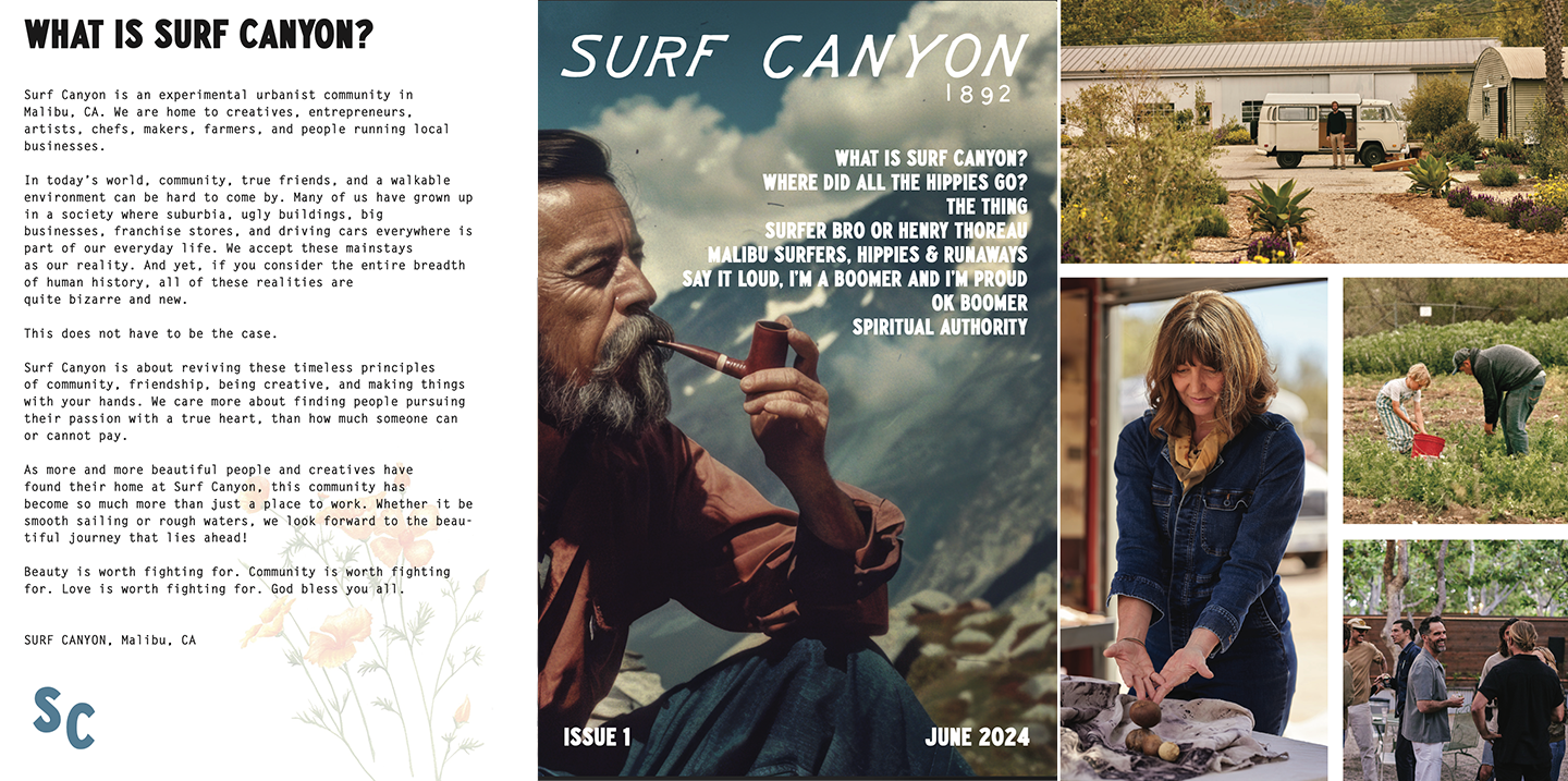
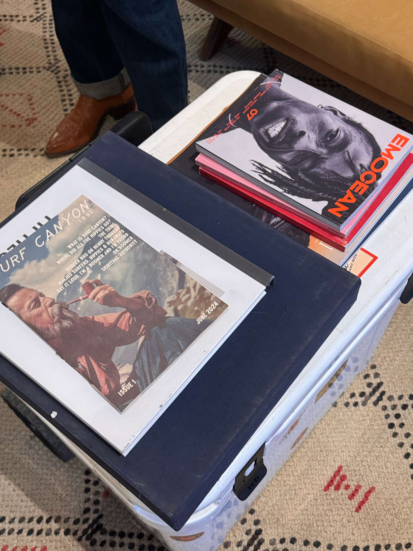
Look at that cover. The typography does so much heavy lifting here. We chose a loose, hand-drawn italic script for "SURF CANYON" that feels organic and approachable—like something you'd see painted on a VW bus or a handmade sign at a farmers market. It's got movement, personality, and imperfection.
But then we anchor it with "1892" in clean, structured type. This juxtaposition says everything: we honor the past, but we're not stuck in it.
Throughout the magazine, I mixed heavy condensed sans-serif headlines (think protest posters and punk zines) with typewriter-style body copy. That typewriter font? It's intentional. It evokes manifestos, underground newsletters, and the kind of raw communication that happened before everything was polished to death on Instagram.
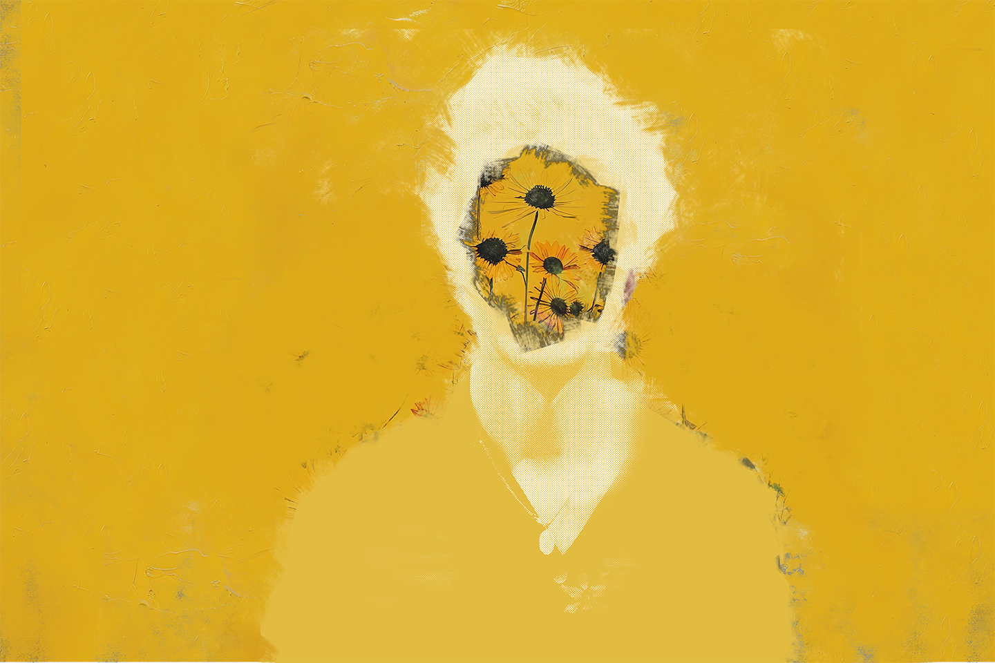
The Cover: A Philosophical Statement
That cover image—Alan Watts, contemplative, set against moody skies—isn't just aesthetic. It asks questions:
"A person who thinks all the time has nothing to think about except thoughts, so he loses touch with reality and lives in a world of illusion."
This is provocative, layered, and unapologetically chewy. It signals that this isn't a lifestyle magazine trying to sell you expensive candles. This is a publication that wants you to think, to question, to remember what mattered before everything became commodified.
The color palette—deep teals, warm earth tones, cloudy grays—feels like Malibu itself. Ocean and canyon. Salt air and sage.
Inside: Where Counterculture Lives
Editorial Voice: Irreverent and Educated
The articles inside don't pull punches:
- "Say It Loud, I'm a Boomer and I'm Proud" by Ben Marcus tackles generational tension with humor and cultural references
- "Where Did All The Hippies Go" by Greg London is a cultural history lesson wrapped in nostalgia
- "Surfer Bro or Henry Thoreau?" asks if tiny houses are the new Walden Pond
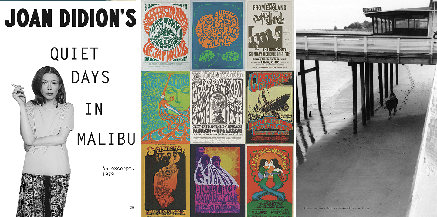
- An excerpt from Joan Didion's "Quiet Days in Malibu" grounds everything in literary legitimacy
This isn't content for content's sake. Every piece connects to the central thesis: What does it mean to live intentionally? Where did the counterculture go? Can we get it back?
Visual Language: Analog Soul
Inside the magazine, you'll find:
- Black and white photography that feels archival and authentic
- Vintage psychedelic poster references (those concert posters are pure 60s/70s San Francisco)
- Community photos showing real people doing real things—pottery, farming, gathering
- Simple layouts that let the content breathe
I deliberately avoided over-designing. No gradients, no trendy effects, no Instagram filters. This is print as artifact. Something you want to keep, reference, share.
Who's This For? (And Who It's Definitely Not For)
The Audience
This magazine speaks to:
- Cultural refugees—people tired of the suburbs, franchises, and car culture
- Makers and creators—those who value craft over consumption
- Philosophical seekers—folks drawn to Thoreau, the hippie movement, and intentional living
- The "spiritual but skeptical"—people looking for meaning but allergic to bullshit
- Boomers and Millennials in conversation—bridging generational gaps through shared values
- Surfers, farmers, artists, and entrepreneurs who happen to live in the same place
This is for people who ask "Why?" and "What if?" a lot.
Who It's Not For
This isn't targeting:
- People who need everything explained or branded within an inch of its life
- Those looking for a glossy escape or aspirational lifestyle porn
- Anyone seeking easy answers or surface-level content
The Result: A Periodical with Purpose
When Issue 1 dropped in June 2024, it wasn't just a magazine—it was a statement of intent. Surf Canyon is serious about building something different. And the design needed to reflect that seriousness while maintaining joy, irreverence, and accessibility.
The response? People came by their HQ at 3728 Cross Creek Road to pick up free copies. They're asking to contribute to the next issue. The magazine became a rallying point—proof that this community isn't just an idea, it's real and growing.
What I Learned
Designing the Surf Canyon magazine reminded me why I fell in love with design in the first place. It's not about making things look cool (though that's a nice bonus). It's about giving ideas the visual language they deserve.
Sometimes that means rough edges. Sometimes it means ugly typewriter fonts and provocative headlines. Sometimes it means choosing historical reference over contemporary trends.
The best design doesn't scream "DESIGN!" It whispers, "This is made by people who care. Come join us."
And in Malibu, at this beautiful, weird, intentional community called Surf Canyon, that invitation is exactly what they needed.