.svg)

There’s a collective hum running through studios, Slack channels, and late-night Figma files. You can feel it in the air—design in 2026 doesn’t want to be beautiful anymore. It wants to be alive. After a decade of grid-perfect branding, dead-eyed minimalism, and algorithm-approved palettes, the world’s creative pulse is swinging hard in the opposite direction. Designers are done optimizing. They’re romanticizing again.
The industry’s new north star isn’t clarity... It’s chaos, with purpose.
Color: Mutiny Against Restraint
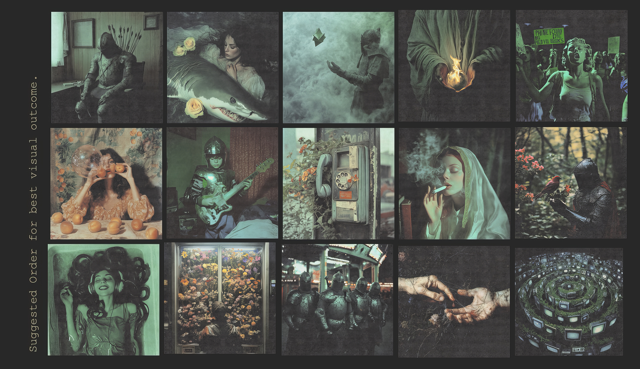
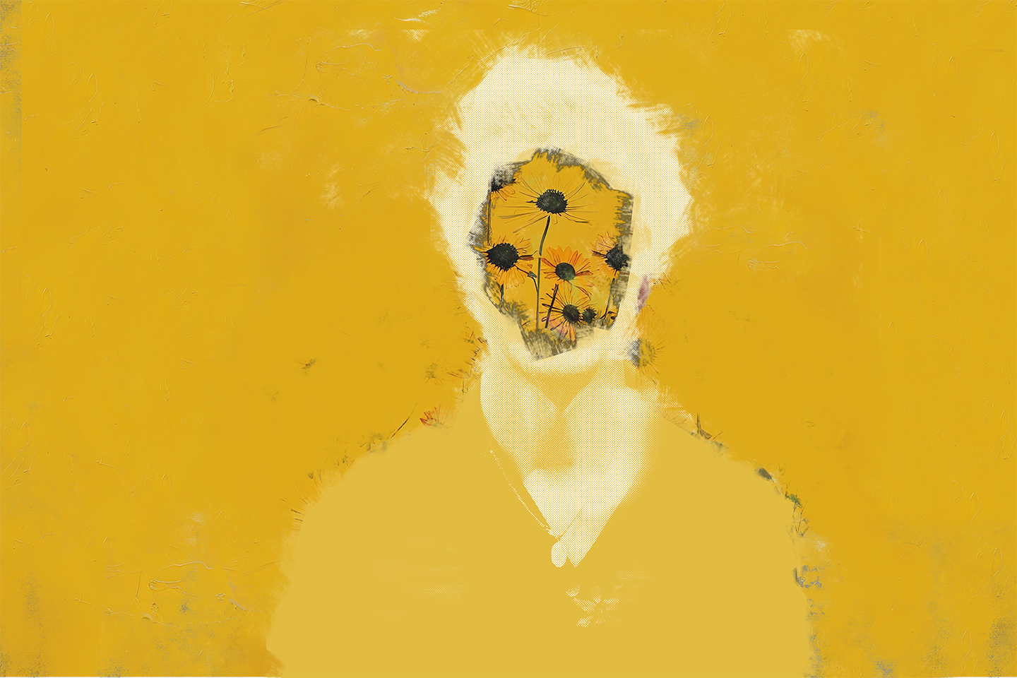
Color is the first casualty of control. For years, everything was “muted,” “pastel,” and “accessible.” In 2026, those words sound like curses. Designers are flooding the screen with violent reds, feverish violets, tarnished golds, and acid greens that feel radioactive. It’s not just about shock value. It’s protest through pigment.
Brands are starting to look less like software companies and more like underground record sleeves. Expect more oil-slick textures, unexpected gradients, and heavy contrast. Black isn’t just a base color anymore—it’s the new chrome.
Psychologically, this isn’t random. People are exhausted by optimization culture. They want mood. They want imperfection. The design world is finally realizing that emotional color is better brand strategy than “approachable blue.”
Type: Character Over Clarity
Typography has stopped pretending to behave. Sans serifs are bending under the weight of their own monotony, morphing into variable fonts that shift, warp, and breathe depending on context. Text is now a living visual—an active participant rather than a passive narrator.
We’re seeing grotesques mutilated beyond recognition, retro serifs stripped of nostalgia, and experimental letterforms that feel half-human, half-machine. Some designers are even using AI to generate custom glyphs—letters that never existed before.
In 2026, type design isn’t about legibility. It’s about attitude. A brand’s voice is now literally in its voice.
Style: The End of Clean
The era of clean, flat, “startup minimalism” is over. It had a good run—simple logos, neutral color palettes, polite grids—but the world moved on. People want friction again.
The new aesthetic is something critics are calling Sensual Brutalism. Think rough textures mixed with soft gradients, 3D motion colliding with hand-drawn illustration, static design resurrected through micro-interaction. Designers are building emotion back into the machine.
Even UI is catching the fever. Interfaces are starting to look human again—buttons that look touchable, text that moves like breath, imagery that feels too real to be vector. You’re no longer supposed to use a product; you’re meant to feel it.
Tools: AI as Co-Conspirator
Artificial intelligence stopped being a threat the moment designers realized it’s not stealing jobs—it’s stealing time. And that’s a good thing. AI has become the creative accomplice. The designer still sets the tone, but the machine now handles the tedium: masking, resizing, recoloring, versioning.
The magic happens in the remix. Designers are feeding AI moodboards, vintage scans, and hand-drawn sketches to generate forms that sit between the physical and the digital. The best work of 2026 doesn’t look like it was made by AI—but it couldn’t exist without it.
There’s an honesty in that hybridity. It’s no longer “man versus machine.” It’s “what happens when man and machine dream together?”
Philosophy: Emotion is the New Metric
Design used to serve business. Now it’s shaping behavior. The most interesting studios in the world aren’t chasing clicks or conversions; they’re designing for attention, emotion, and memory. The modern designer isn’t an executor—they’re a cultural architect.
The guiding question isn’t “does this look good?” It’s “does this make someone feel something?” That shift changes everything—from typography to motion to how we define success. In an oversaturated digital world, emotion has become the last true differentiator.
We’re leaving the algorithmic era behind and re-entering the human one. The work that breaks through now feels personal, not polished. Messy, not mechanical. It dares to break something to see what bleeds.
Conclusion: The Return of the Designer as Author
2026 isn’t the year of a new trend. It’s the year of new authorship. Designers aren’t just shaping aesthetics—they’re shaping meaning again. The pendulum has swung back toward storytelling, toward narrative-driven branding that feels as alive as the people behind it.
We’re entering a visual renaissance born from rebellion. The grid is cracking. The color wheel is burning. Type is dancing.
Design is dead. Long live design.